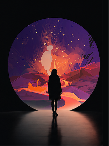
PEPITOS:
The Beak Saga
Visual identity and campaign design for a Meta funded immersive experience.
Role:
Creative Direction
Visual Design
Marketing Assets
Created:
• Festival posters
• Social media graphics
• Promotional materials
• Digital campaign assets
• Brand consistency across platforms
• Trailer and video teasers
The launch of PEPITOS: The Beak Saga presented a unique branding challenge. As a new original IP created for an emerging immersive medium, the campaign needed to establish immediate recognition while introducing audiences to a format that many had never experienced before.
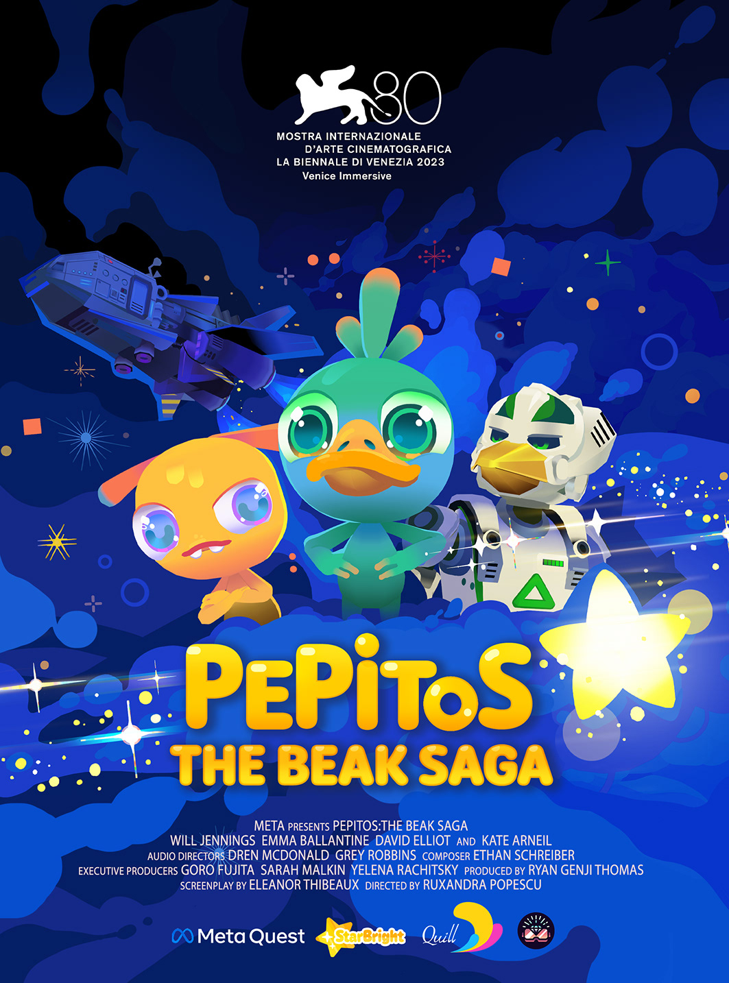
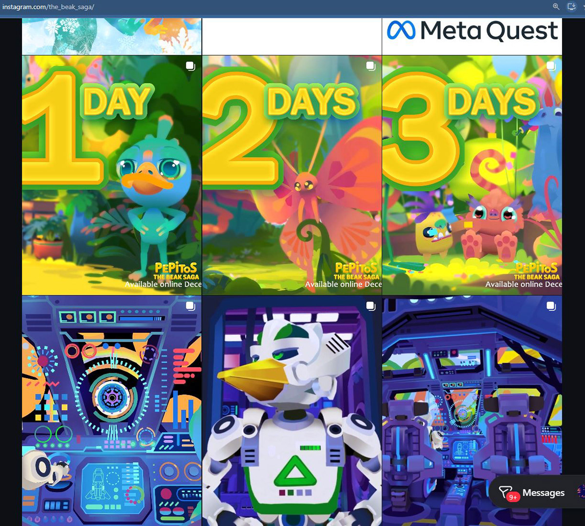
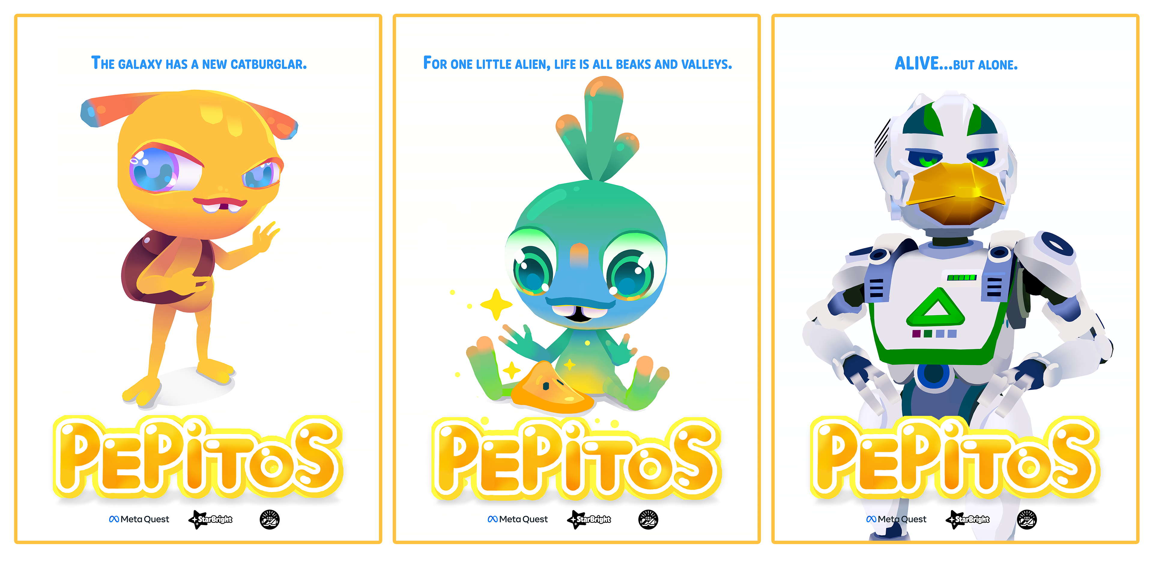
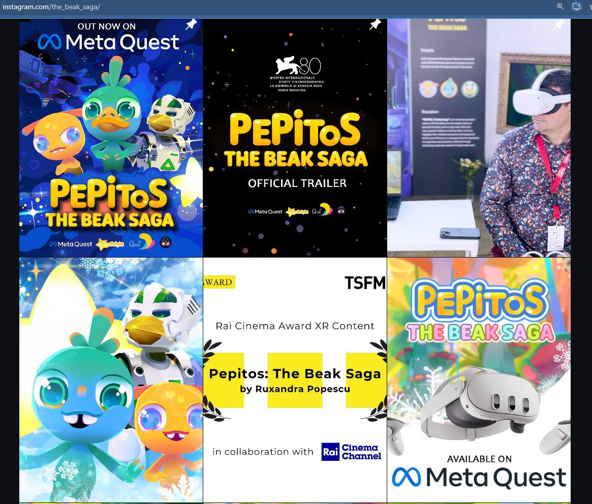
For this campaign, I adopted a vibrant colour palette in creating a consistent visual language across posters, promotional graphics, trailers and social media. Instagram formed a central part of the campaign strategy, so the feed was designed as a cohesive visual system. Posts were planned in groups of three to align with Instagram's three column grid, allowing each row to communicate one idea. The launch campaign also incorporated a visual countdown that gradually built anticipation ahead of the premiere and introduced new artwork.
Communications focused on the characters, humour and warmth, helping audiences connect emotionally with the experience before introducing the novelty of immersive storytelling. This was particularly important for engaging younger audiences and families.
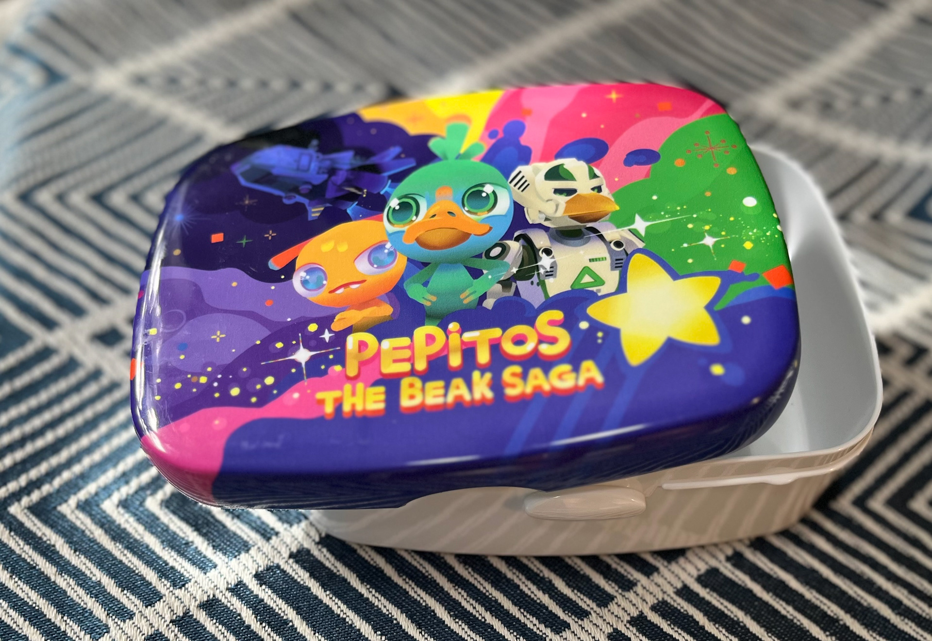
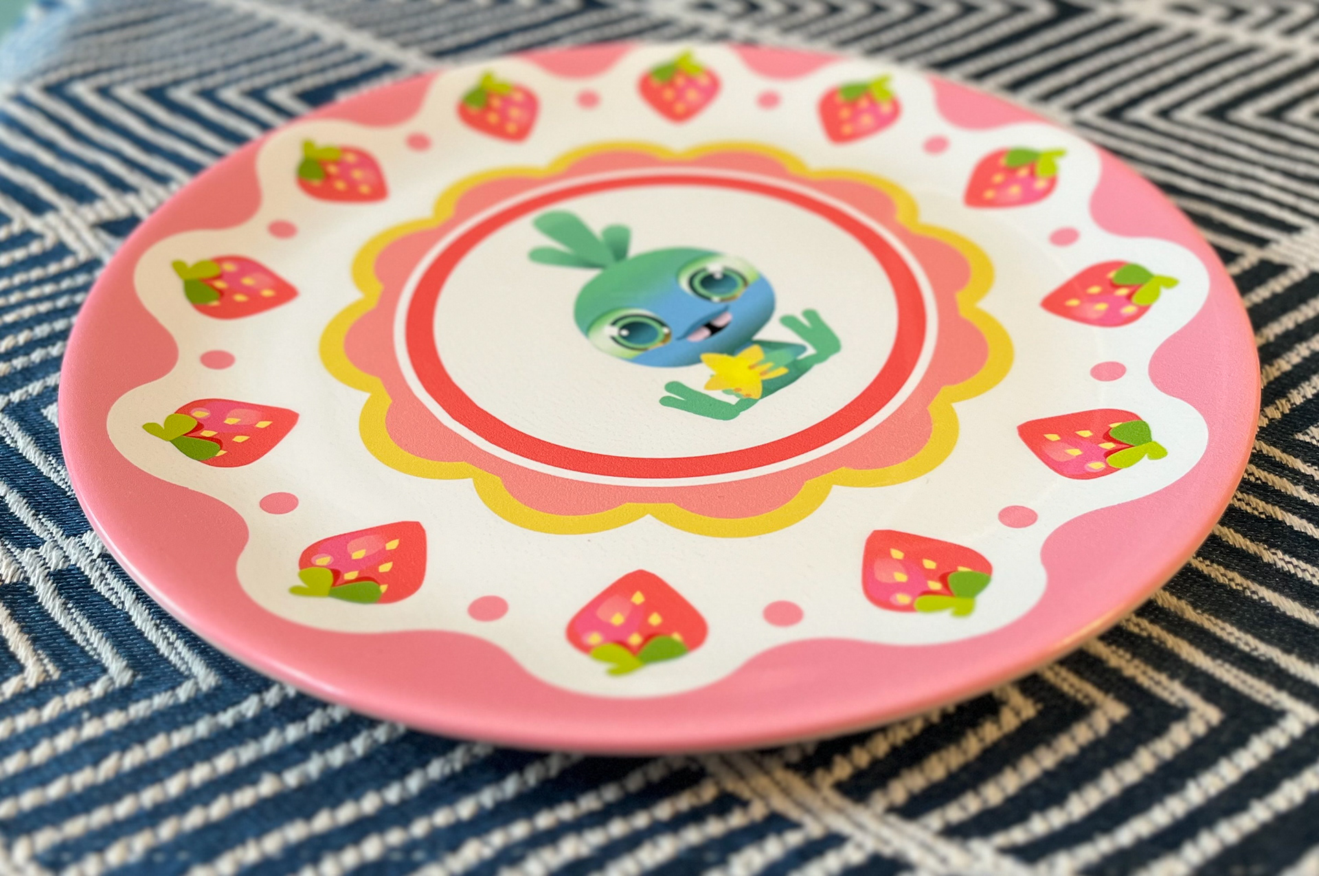
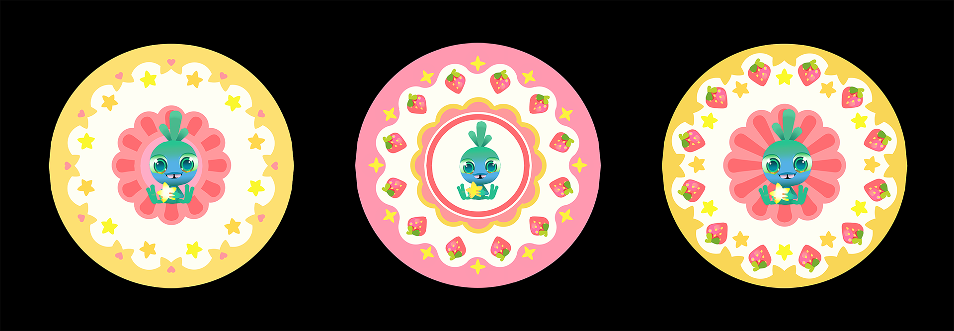
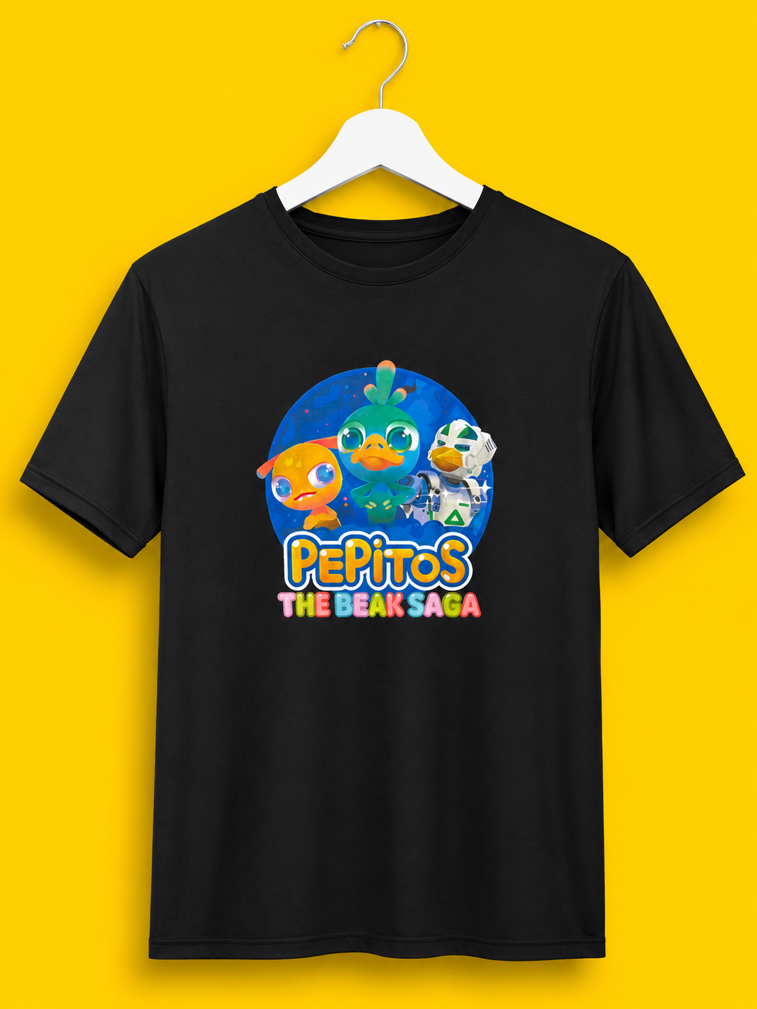
As part of the launch campaign for PEPITOS: The Beak Saga, I developed a collection of branded merchandise designed to extend the project's visual identity beyond the digital experience. I researched and coordinated with print suppliers to prototype a range of physical products, ensuring quality, consistency and production feasibility throughout the process.
The merchandise was designed as a natural extension of the brand, using a playful illustration style and friendly rounded typography to maintain a cohesive and recognisable identity across every medium. The colour palettes are consistently vibrant and high contrast, to reflect the emotional tone of the IP. Product selection was guided by the intended audience, with items such as lunchboxes, plates and T-shirts chosen to align with the everyday habits and interests of younger users and families.
The StarBright identity that the experience was launched through was designed around the recurring star motif.
My intention was to create a cohesive brand mark that communicated optimism, curiosity and playfulness.
The logo reinforces the themes of imagination, exploration and wonder that define the experience. The star is intentionally tilted to create a sense of movement, giving the impression that it is soaring across the page. From a distance, the rounded typography merges with the star, creating the illusion of a glowing magical trail.
This composition was deliberately developed to introduce energy into the design, making the logo feel alive.
The soft geometry, bold silhouettes and warm golden colours were chosen to create a friendly visual language inspired by contemporary character brands.

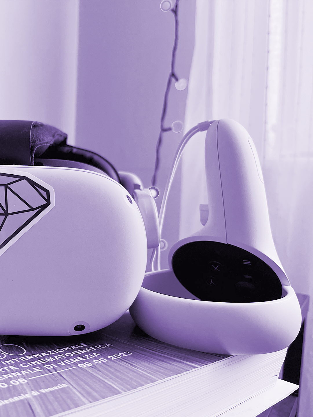
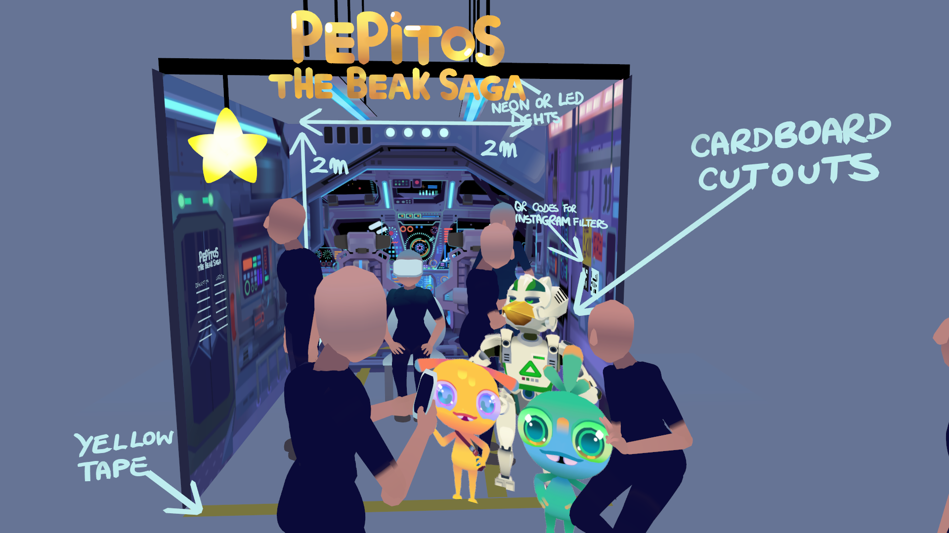
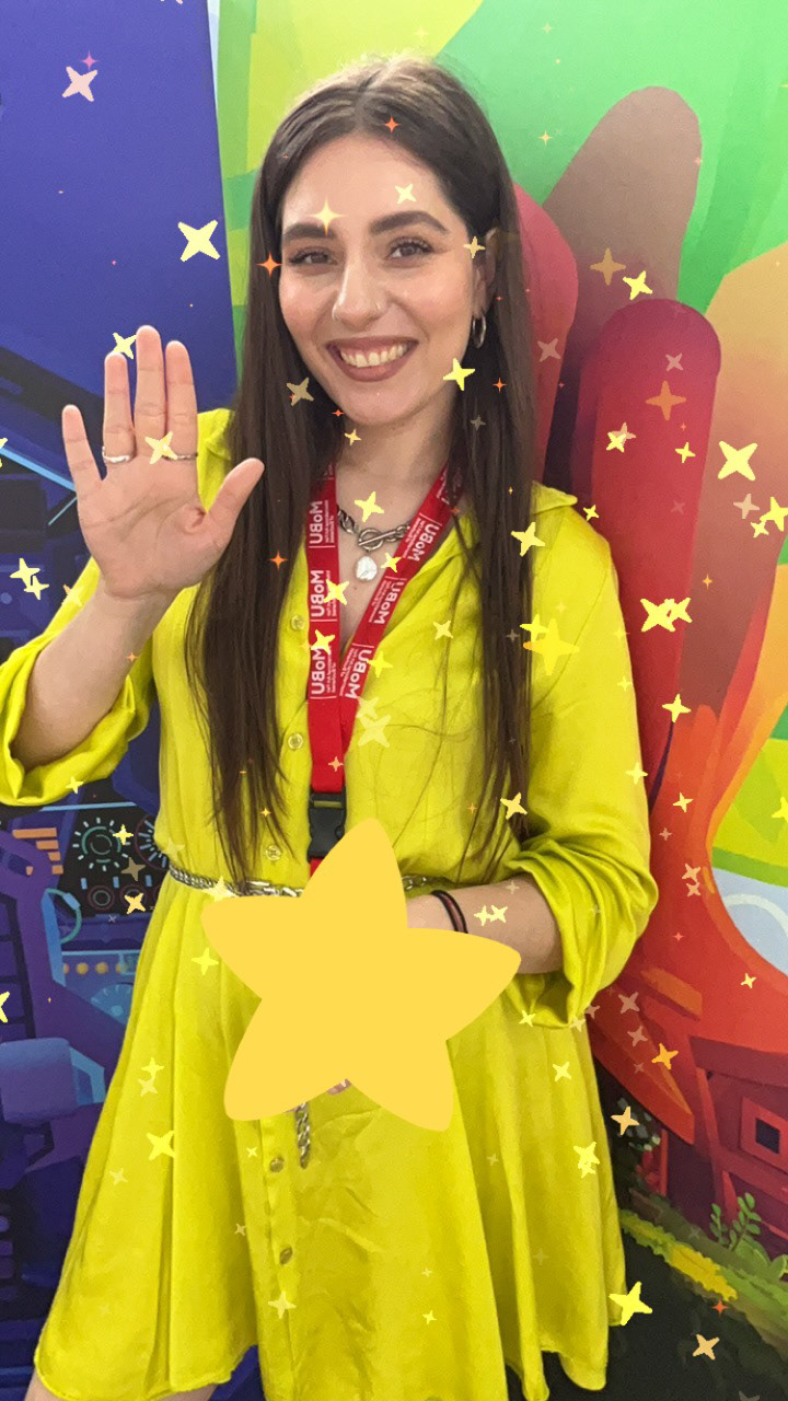
I designed two exhibition concepts to support PEPITOS: The Beak Saga across different event scales, ensuring the experience could be presented effectively regardless of the available space. Both layouts centred around at least one VR headset. The compact version was designed for smaller exhibition booths, incorporating branded graphics, character standees and QR codes linking to interactive Snapchat filters, encouraging visitors to engage with the digital world, capture photos and continue interacting with the brand after leaving the stand.
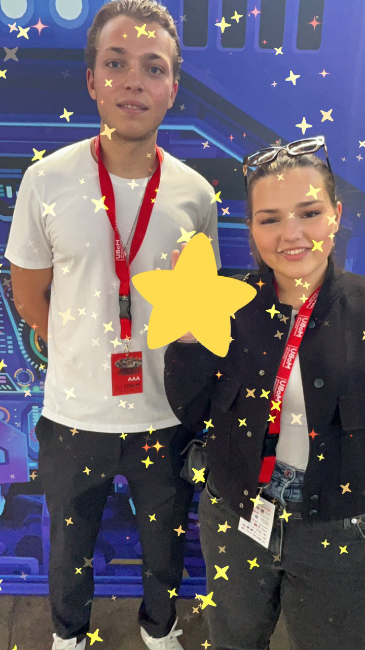
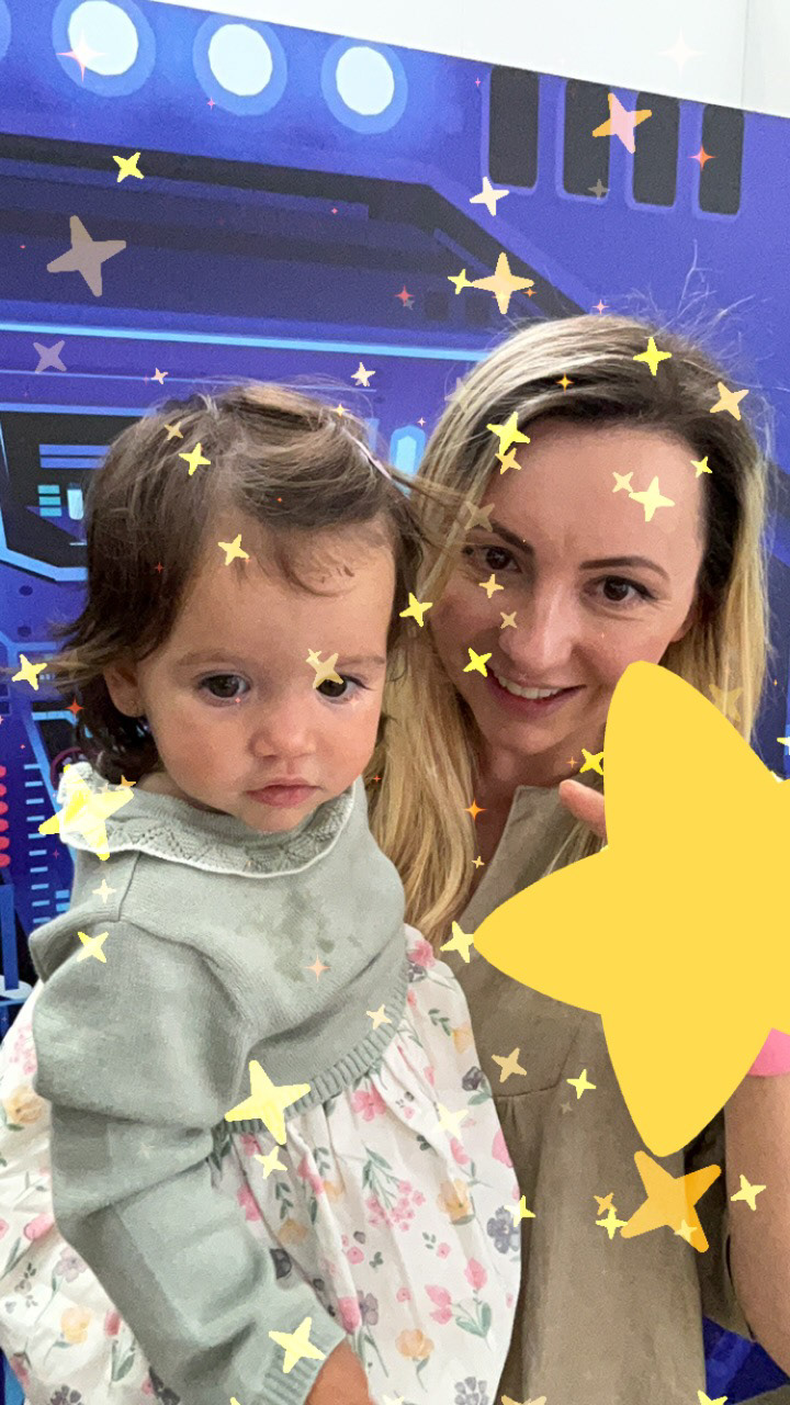
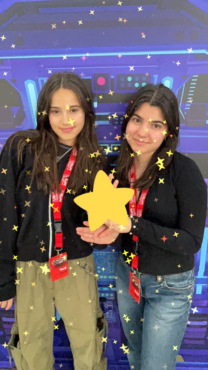
For larger exhibition spaces, I developed a more immersive visitor journey designed to maximise visibility and engagement. A dual-screen setup was proposed, with one display continuously playing the trailer to attract attention while the second showing a live feed from one of two VR headsets, allowing waiting visitors to experience the reactions of those inside the story. To encourage social media engagement, I designed an interactive photo station where visitors could pose with high-quality printed backgrounds from the experience and an interactive augmented reality filter using a provided tablet.
Designing exhibition materials, layouts and user journeys for festival display.
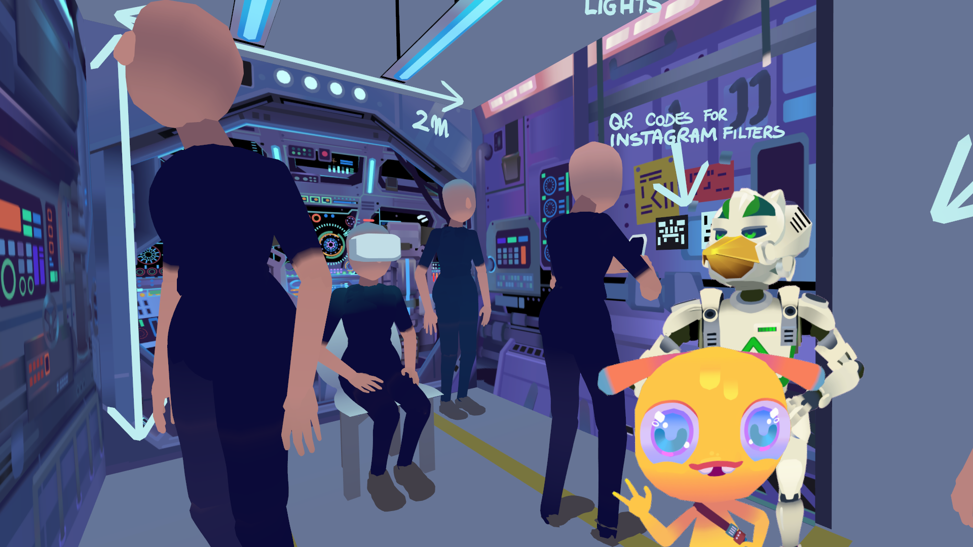
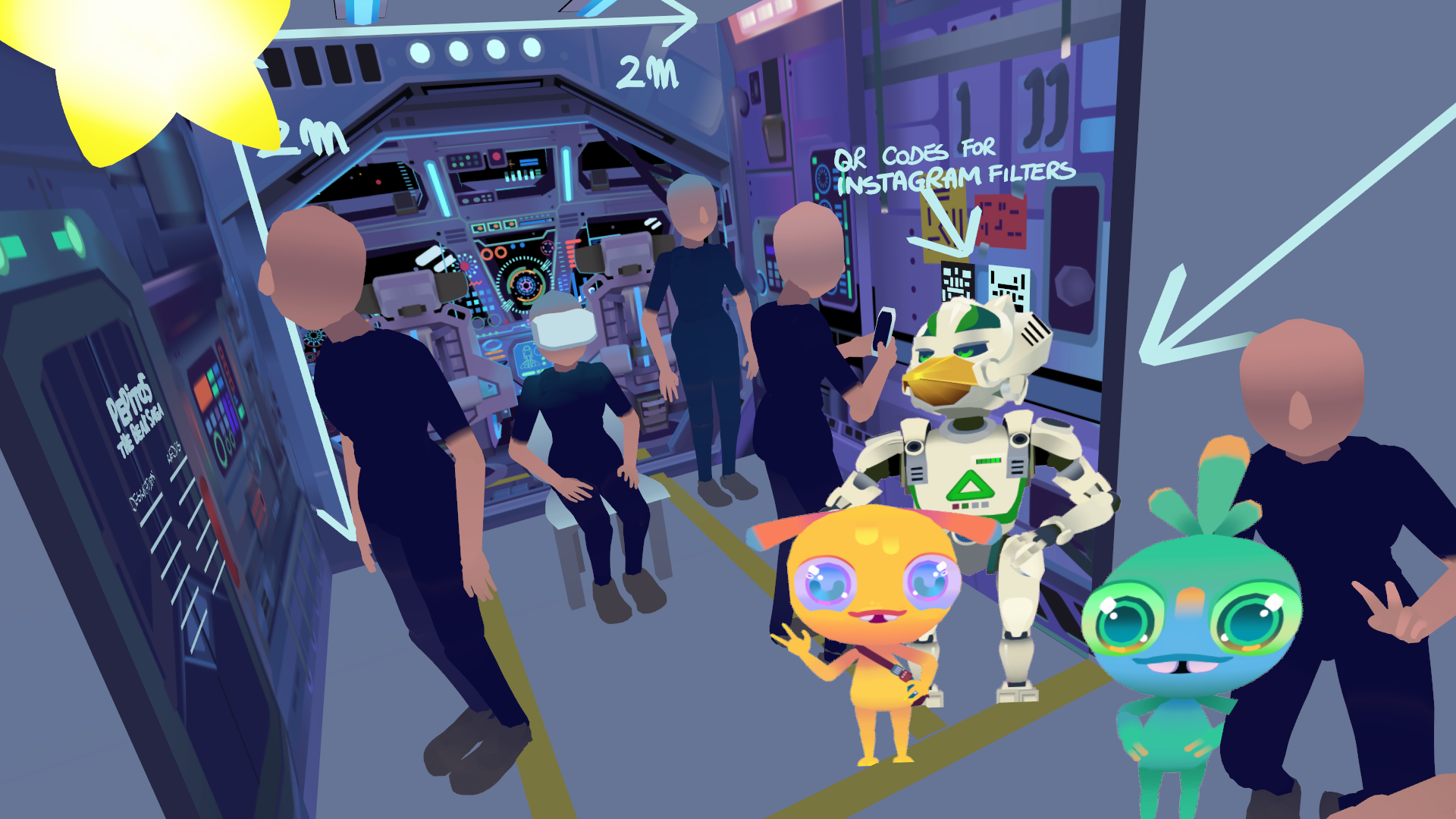
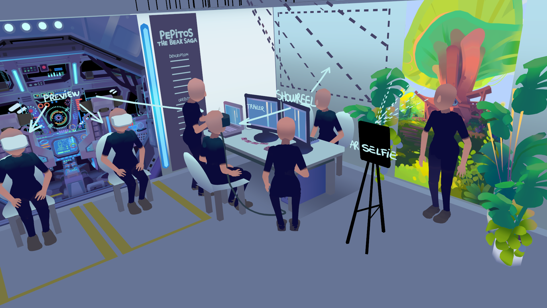
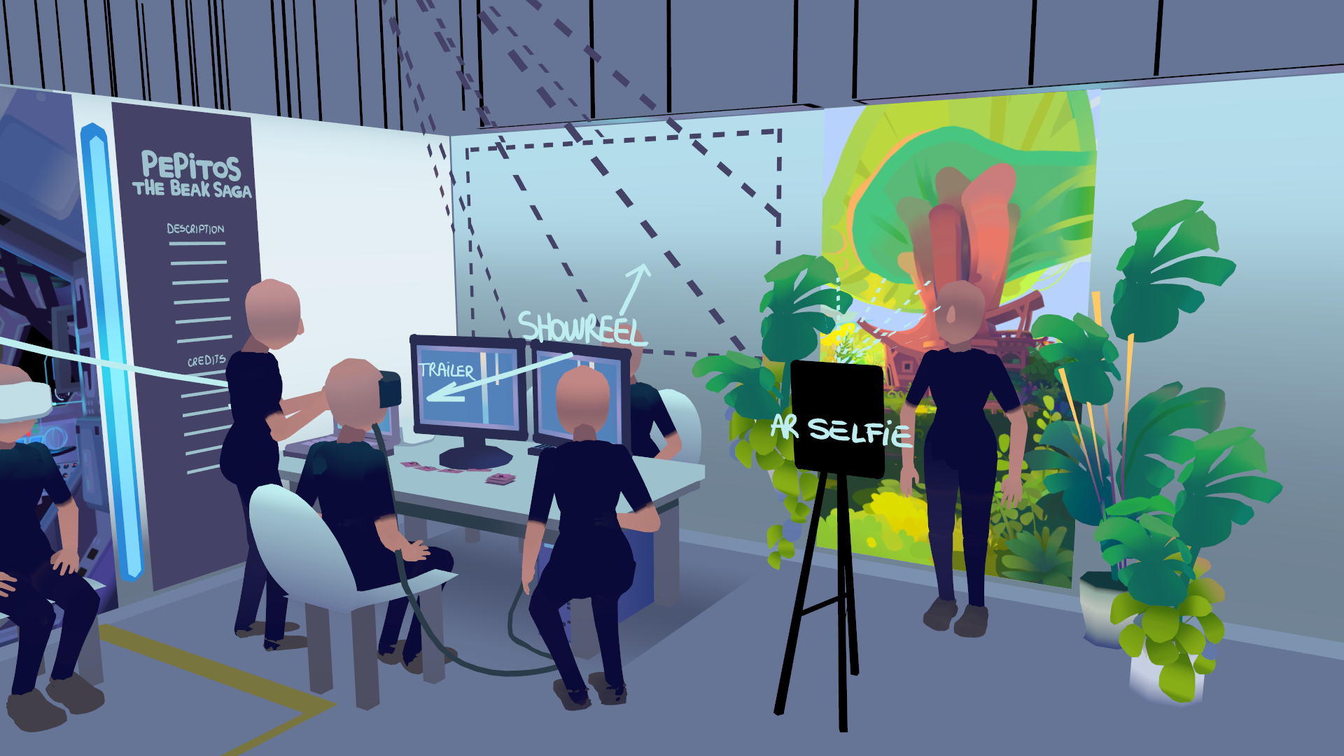
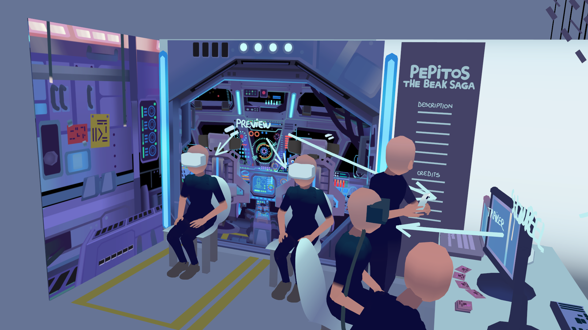
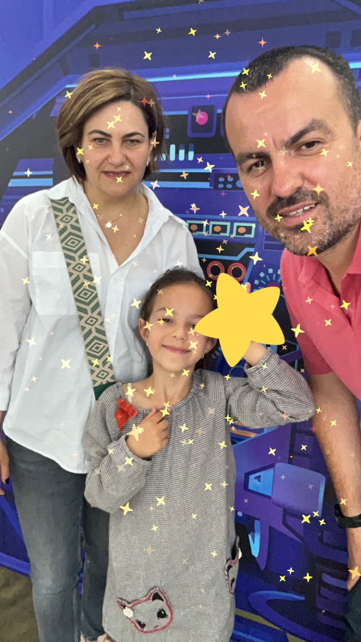
The second concept was put into practice during MoBU, the largest contemporary art fair in Eastern Europe, where I introduced the project to the public ahead of its Venice premiere, generated early awareness and gathered valuable audience feedback.
The campaign was further supported by teaser content released before the event and audience reaction videos captured afterwards, helping build anticipation, validate public engagement and reinforce the experience as a compelling new IP.
Reimagined Vol ll:
MAHAL
Visual identity for a Meta funded immersive experience.
Role:
Visual Design
Marketing Assets
Created:
• Festival posters
• Social media graphics
• Digital campaign assets
• Brand consistency across platforms
Reimagined Vol II: MAHAL required a visual identity that respected the emotional weight of the story while creating a recognisable brand across festival, digital and promotional materials.
As part of my role on this production I worked closely with the director to develop a cohesive visual language that balances cinematic drama with elegance, using a restrained colour palette.
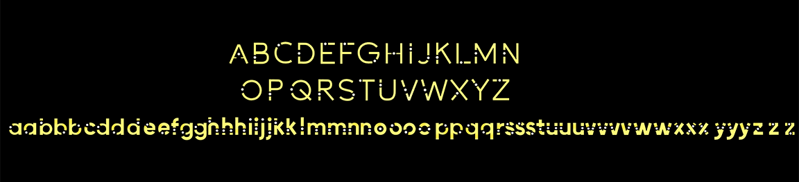
I also designed a bespoke display typeface used throughout the title treatment, credits and promotional materials, giving the project a distinctive typographic voice.
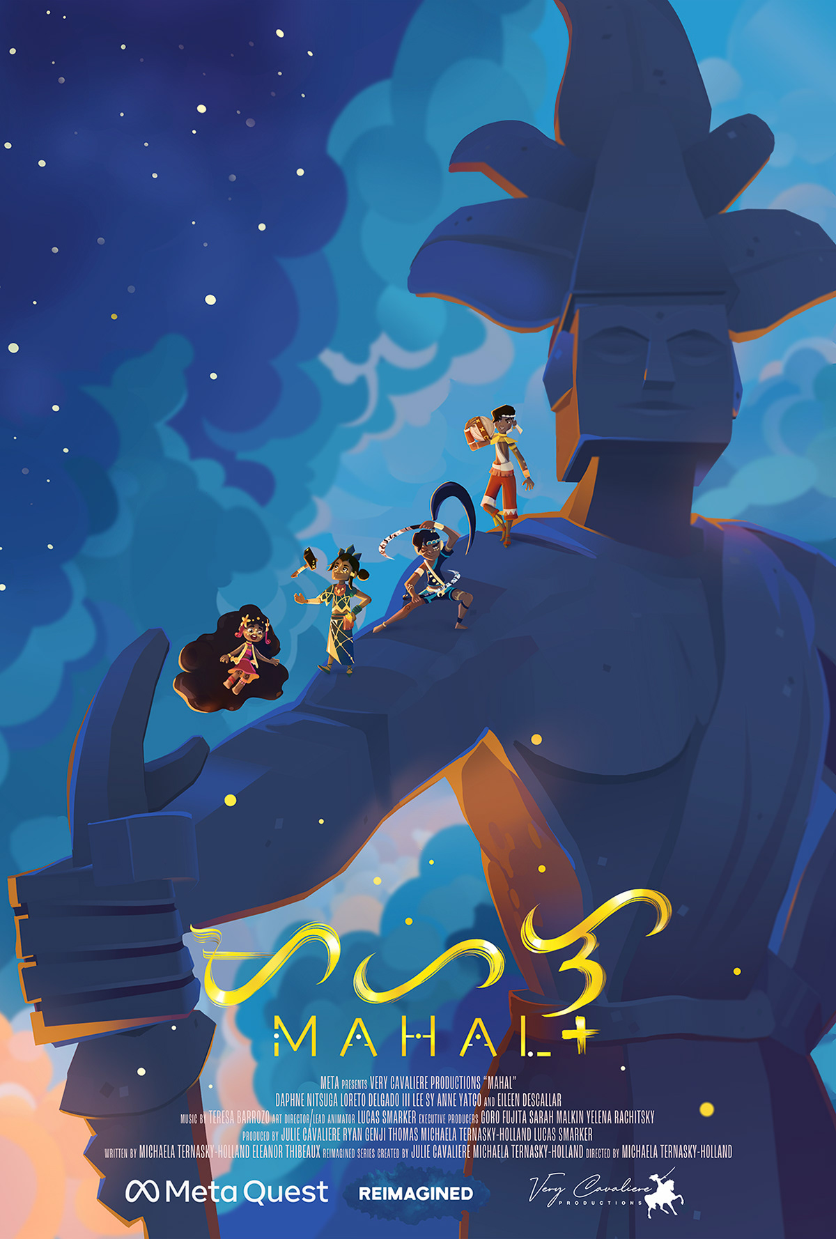
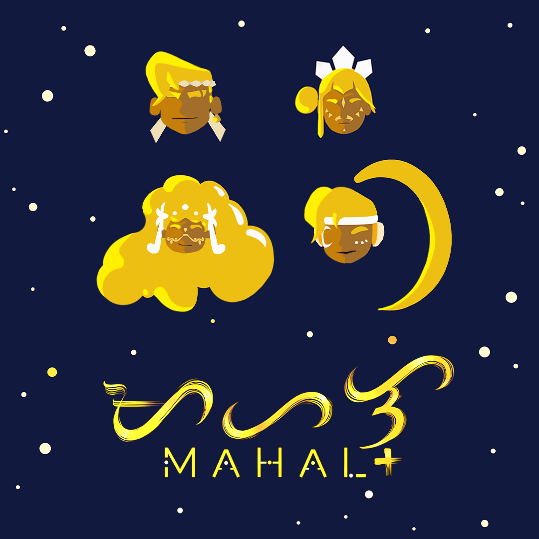
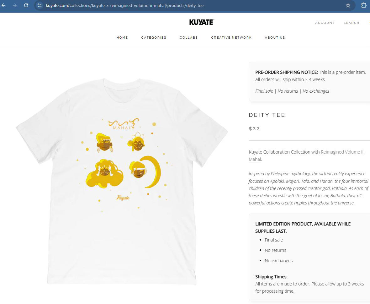
In adition to creating graphics to be adapted for merchandise printing, several poster mockups were proposed, each one focusing on a different emotional tone. The poster designs chosen to be developed were delivered in vertical, square and wide format to be used across social media platforms and promotional materials.
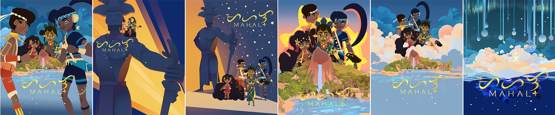
Reimagined Vol II: MAHAL premiered at the Tribeca Festival, where the visual identity was extended into the exhibition space. The posters were presented in large format backlit displays making the rich colour palette and layered compositions glow with an ethereal quality. This reinforced the emotional tone and cinematic quality established throughout the campaign.
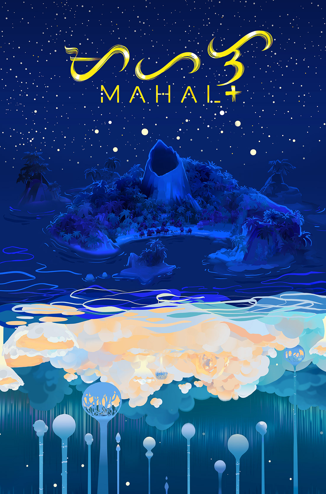
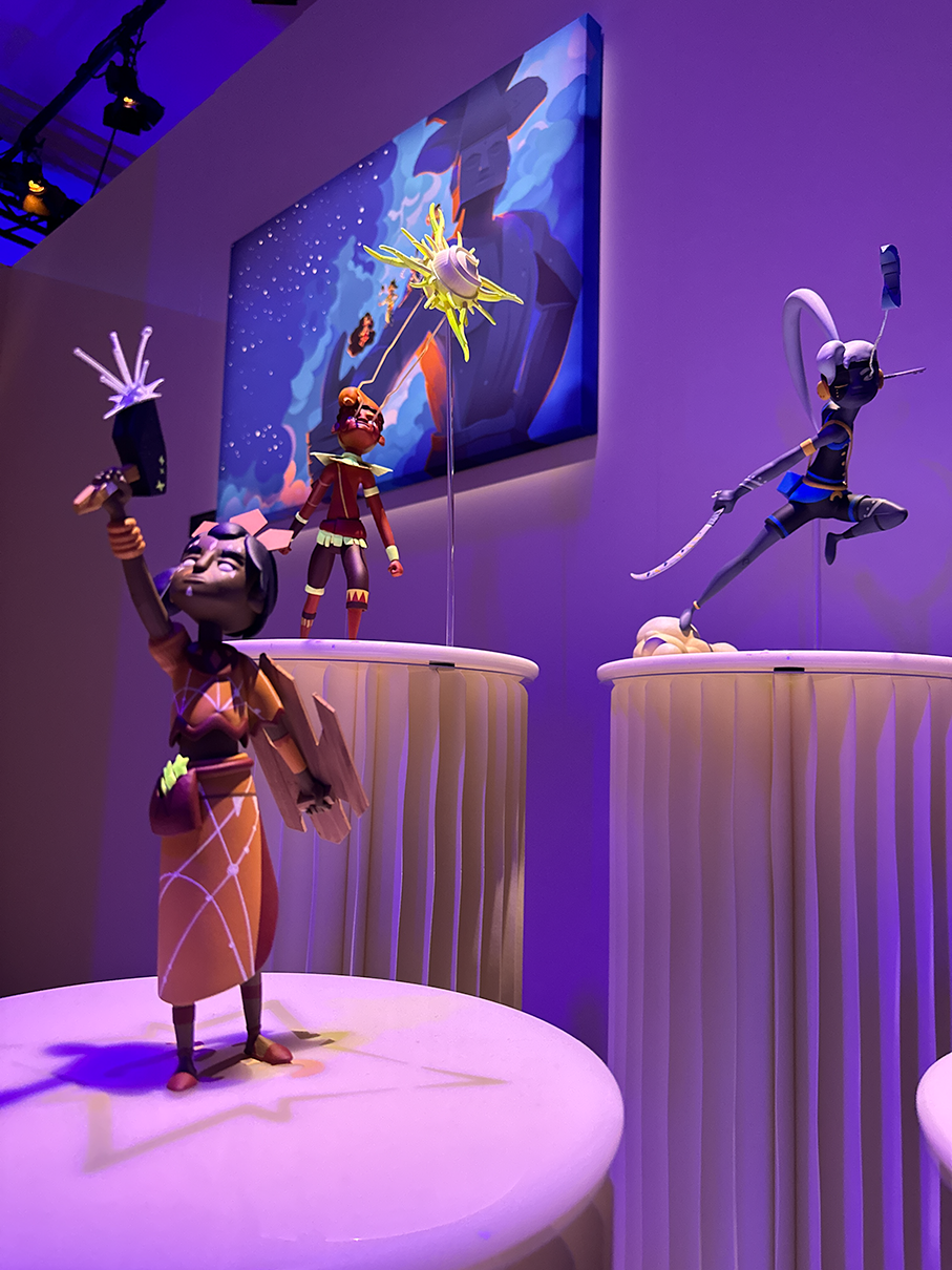
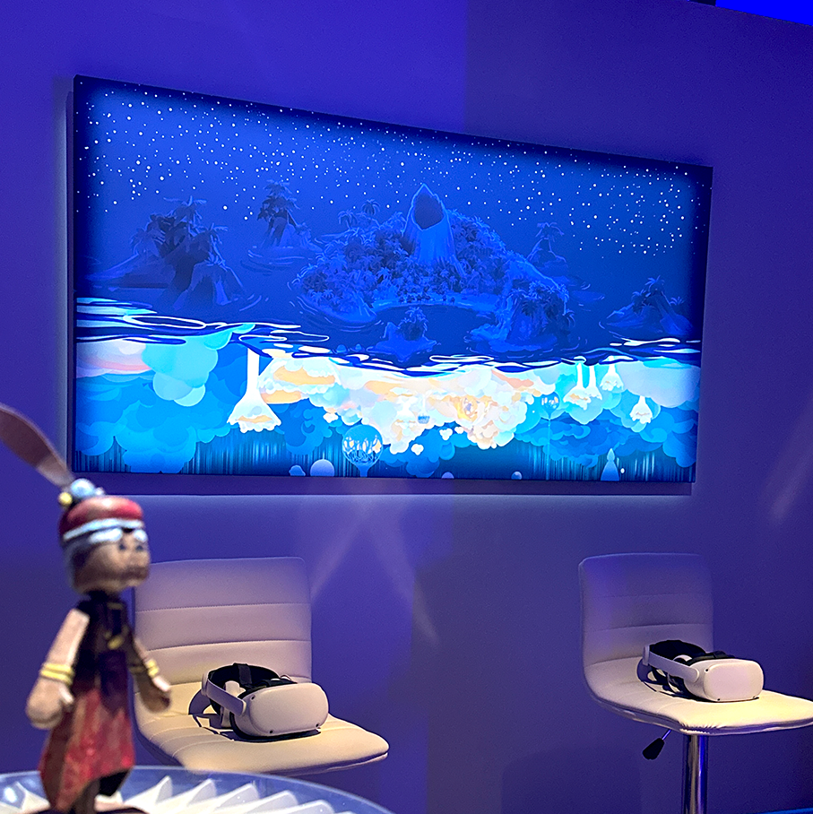
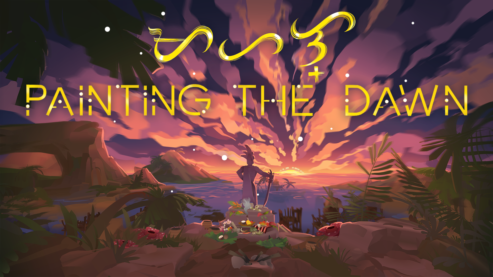
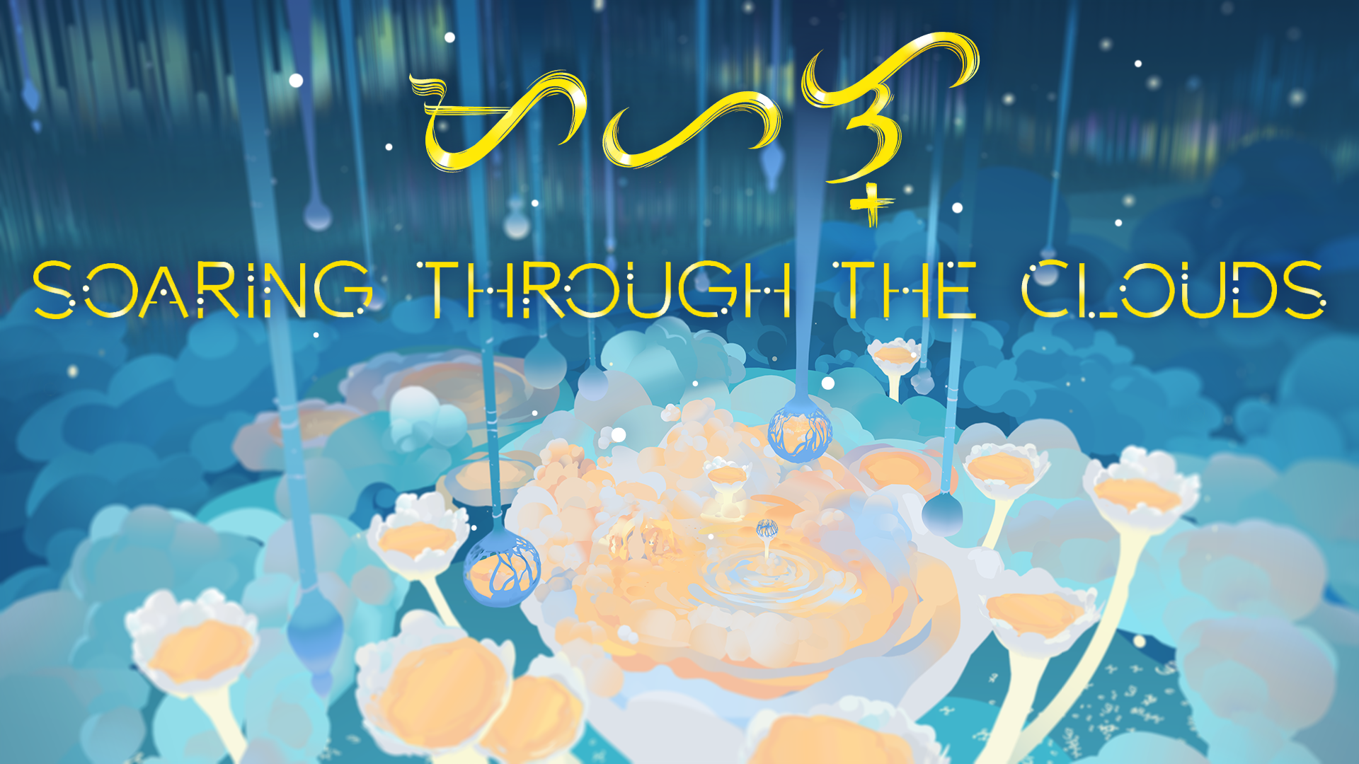
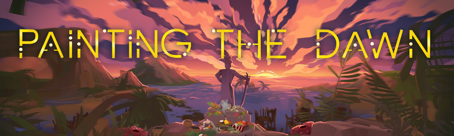
In the process of creating the campaign's visual assets I carefully considered typography and atmospheric compositions to reflect the project's themes of mythology, grief and hope. Additional images (above) were created and processed for different social media formats and website displays such as title cards and banners.
The Lost Forest
Visual identity and campaign design for a mixed media animated story.
Role:
Visual Design
Marketing Assets
Created:
• Social media graphics
• Promotional materials
• Digital campaign assets
• Brand consistency across platforms
• Trailer and video teasers
For The Lost Forest, I designed a focused launch campaign that explored how traditional design assets could be enhanced through emerging technology.
Although the campaign was intentionally small in scale, each element was designed to create a deeper connection between the audience and the world of the project.
Video teasers, 3D photos and behind the scenes style explorations were shared online to promote the IP before its public screening.
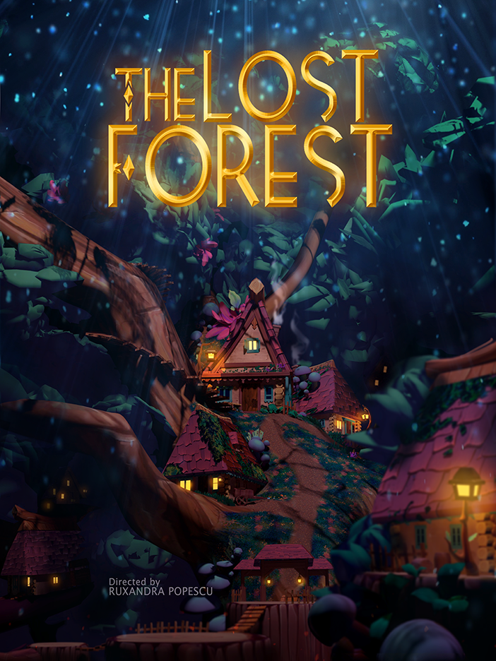
A central piece of the campaign was a printed art book combining traditional publishing with augmented reality through Artivive. Key scenes from the short animation were selected to be interactable, allowing viewers to experience animation and storytelling directly from the physical artwork. This created a bridge between tangible design and digital immersion.
I also designed a virtual exhibition display that could be explored through Sketchfab, where audiences could interact with the project remotely or experience it through VR. The environment acted as an interconnected hub, linking directly to the immersive VR scene, large format promotional artwork, my contact information, and social platforms. Through this campaign I explored how creative technology can enhance audience engagement, extend the life of an artwork, and create new exciting pathways between physical and digital.

Brand Mascot
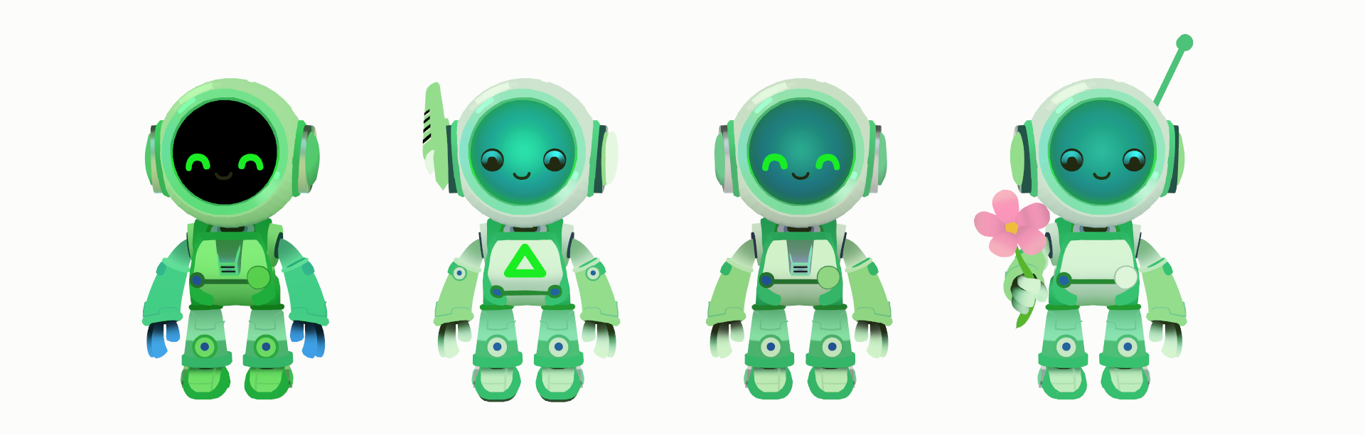
3D brand mascot designs for an Eco-Green initiative led by Synotech.
Event Banner Designs
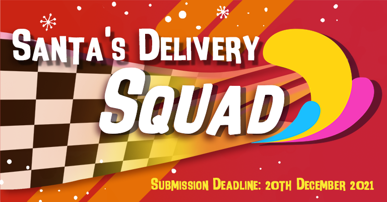
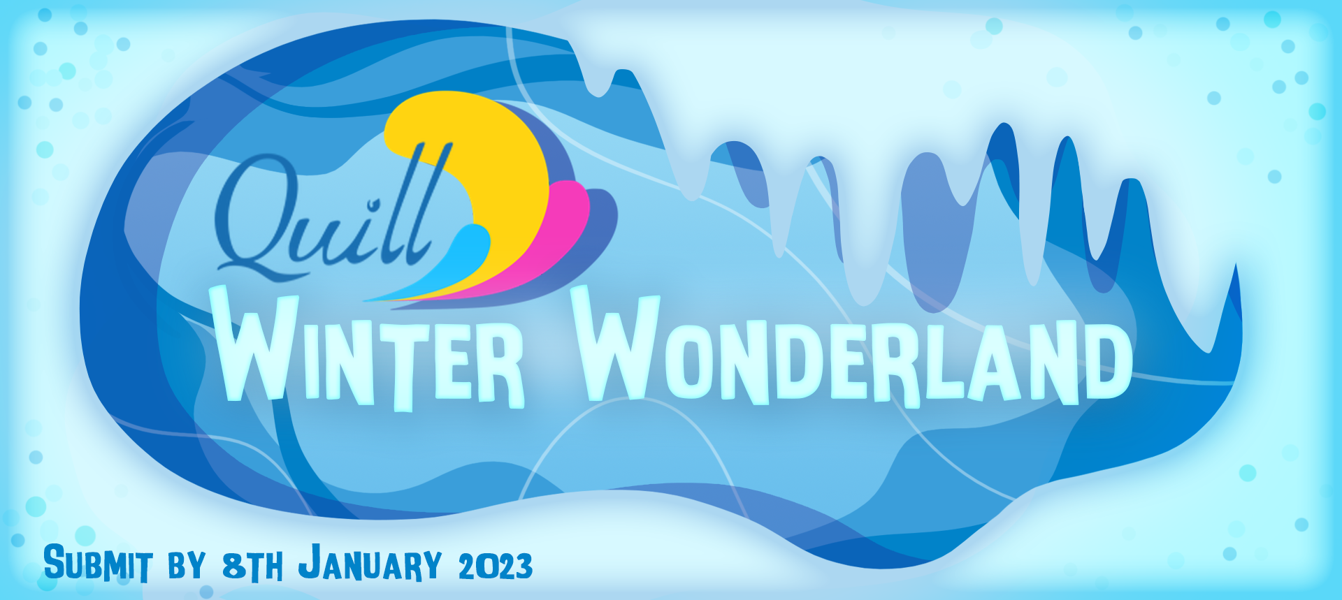
As an Admin, I actively supported the VR Animation Community by organising virtual events, leading technical workshops, and creating opportunities for artists to collaborate and learn from one another.
Part of my initiatives required designing event branding, social media assets, schedules, customisable VR templates, submission guidelines, and technical documentation. Following each community event I also created materials to engage the wider artistic communities and promote the results.